Google UX Design Professional Certificate
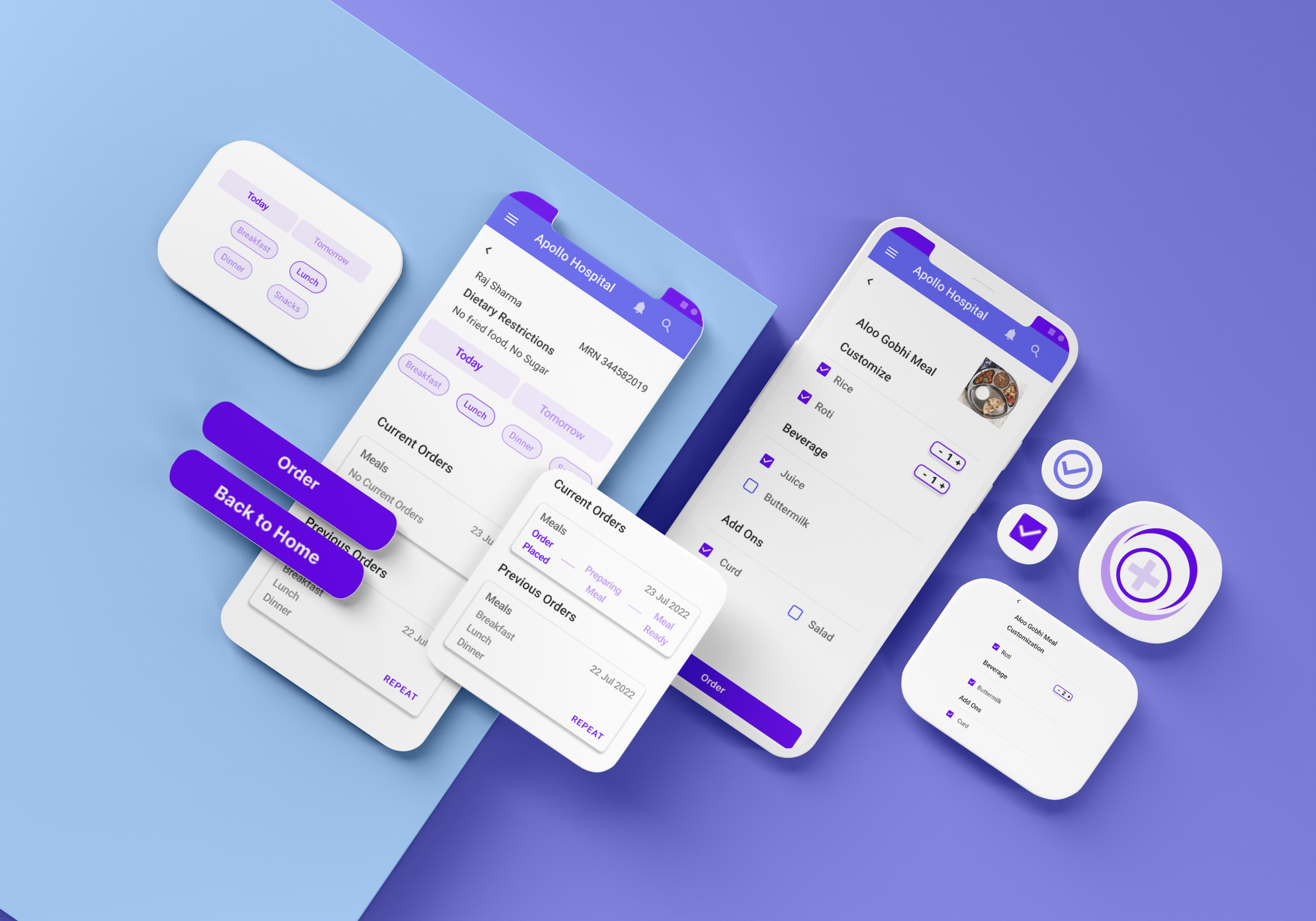
Order Easy
Project Scope
This is a case study for an app I designed as part of the Google UX Design Professional Certificate online course.
Goal: To design an intuitive mobile app that simplifies the meal ordering process for hospitalized patients, their family memebers and caregivers, ensuring a seamless and accessible experience that meets their dietary and medical needs.
The Challenge: Many hospitalized patients struggle with ordering meals due to complex menus, dietary restrictions, and limited accessibility options. This results in frustration, incorrect meal deliveries, and increased food waste.
The concept draws from personally experiencing how inconvenient meal ordering is very for admitted patients when hospitals still rely solely on staff making a new paper record for each meal.
Skills: Empathy Mapping, User Personas,User Interviews, Moderated Usability Testing, Wireframing, Prototyping
Team and Role: Solo Project, UX Researcher and Designer
Date: August 2022

My Approach
User Personas
Identify pain points in the current manual meal ordering system and which groups these problems affect
Create User Personas which represent the target audience, who could potentially benefit from this app

Wireframing and Prototyping
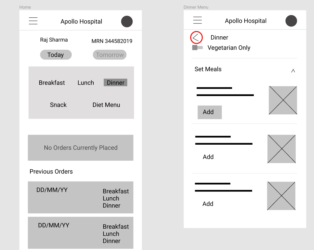
Low Fidelity Wireframe
These wireframes focus on the layout and structure rather than detailed design elements, allowing me to visualize the basic functionality and user flow. Created in Figma using simple shapes and placeholders, low fidelity wireframes highlight the arrangement of content, navigation elements, and interactions.

Moderated Usability Testing, Round 1
Next, I tested this prototype on 5 users. This approach facilitated quick iteration and testing of ideas, enabling me to identify user experience issues early in the project.
Initial Insights:
Fixing technical issues like the back button on some screens
Adding separate Login screen. As the hospital already has the patient records, the patient themselves need not login into the app. However, during the testing some users suggested that there should be a Login screen, as that is what familiar
Style Guide and Design System
Usability Testing, Round 2


Highlights:
Personalized Meal Suggestions: Recommendations based on dietary restrictions and medical conditions.
Accessibility Options: Voice navigation, high-contrast mode, and text-to-speech functionality.
Real-time Order Tracking: Patients can view meal preparation and estimated delivery times.
Task Analysis
4/5 Participants were able to successfully complelte the meal ordering process and return to the homescreen
3/5 said simplifying the customization options for the meals would make it easier to order as this is for a hospital meal and not a restaurant. This would reduce the steps the user would need to take while ordering the meal and may also eliminate any additional confusion caused due to too many choices.
It would be a good idea to add a “Repeat” option which would make it easier for a user to place their order without having to go through the whole meal ordering process.
Takeaways
This project demonstrated the importance of user-centered design in healthcare technology. By prioritizing accessibility, personalization, and usability, the hospital meal ordering app significantly improved the patient experience and operational efficiency. Future iterations may incorporate multilingual support and integration with wearable health devices for enhanced dietary monitoring.
I learnt quite a bit about how the meal ordering system operates in this particular hospital. There are many things to take into account - from the hospital’s catering company to the staff- when planning on implementing such a change